01
Project Vision
User research showed that current shopping experience provided by most apps puts users in a position where they aren't confident about the sizing of clothes that they order.
Therefore, my goal when designing this shopping app for Bershka, a popular clothing store, was to allow users to save time while shopping, purchase clothing with reliable sizes, and engage in an experience that allows them to feel included while shopping with ease.
02
Objectives
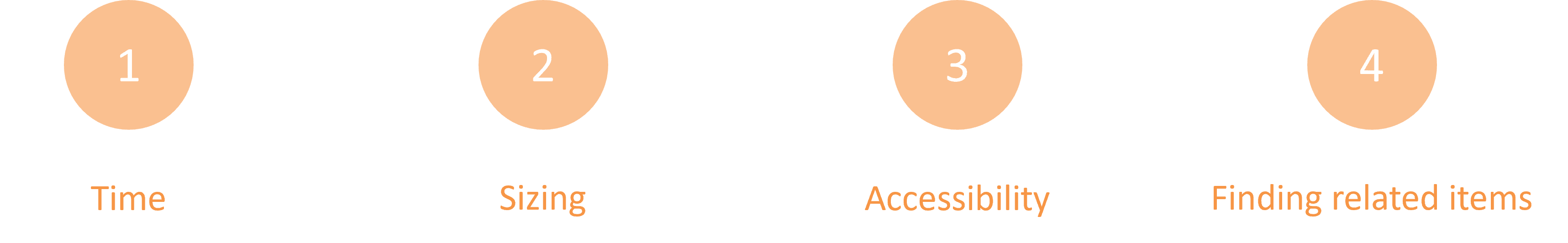
Design a mobile app that saves time and resources for users.
Include solutions that allow users to find reliable sized clothing on the app.
Design an inviting experience which facilitates fluid navigation within the app
Design features like high contrast options, compatibility with screen readers, etc. to make app accessible.
Maintain brand identity in the visual design of the app.
03
My Role
My responsibilities entailed conducting user interviews to identify pain points, creating user personas and journey maps, laying out the information architecture for the app, wireframing and prototyping in Figma, and conducting usability tests with users.
04
Understanding the User
The objectives of the project, as summarized above, were outlined based on results gathered from user interviews. Candidates for these interviews were chosen from varying age groups and ethnicities. This was because I wanted to create a design that was inclusive and catered to all types of users. Several pain points were identified based on the information gathered from these interviews. These pain points dictated the rest of the design process.
With the user pain points identified, the next step was to build empathy towards groups of users and provide a voice to the goals and frustrations of the users. To achieve this, 2 user personas were created.
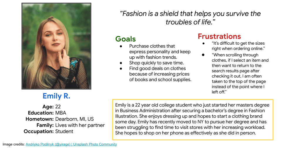
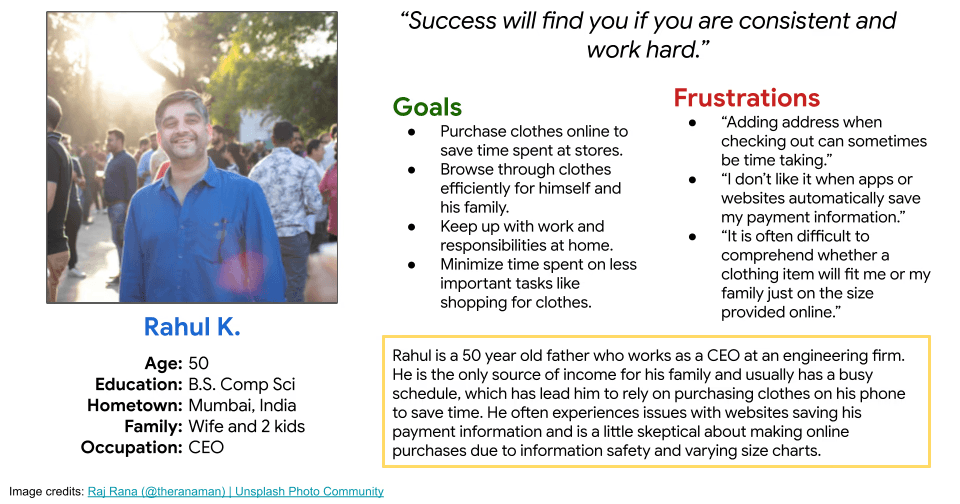
User personas created based on a first round of user interviews
05
Defining the Problem
After conducting user research, I had a lot of information about what problems users have had with shopping apps, but no good lead on where to begin when designing to solve these problems. To convert research findings into achievable goals for the project, I created user journeys based on the personas that were created earlier.
An example of a user journey map created for Emily has been included below. This map helped visualize possible solutions to user needs and helped me ease into the next phase of design-thinking, Ideation.
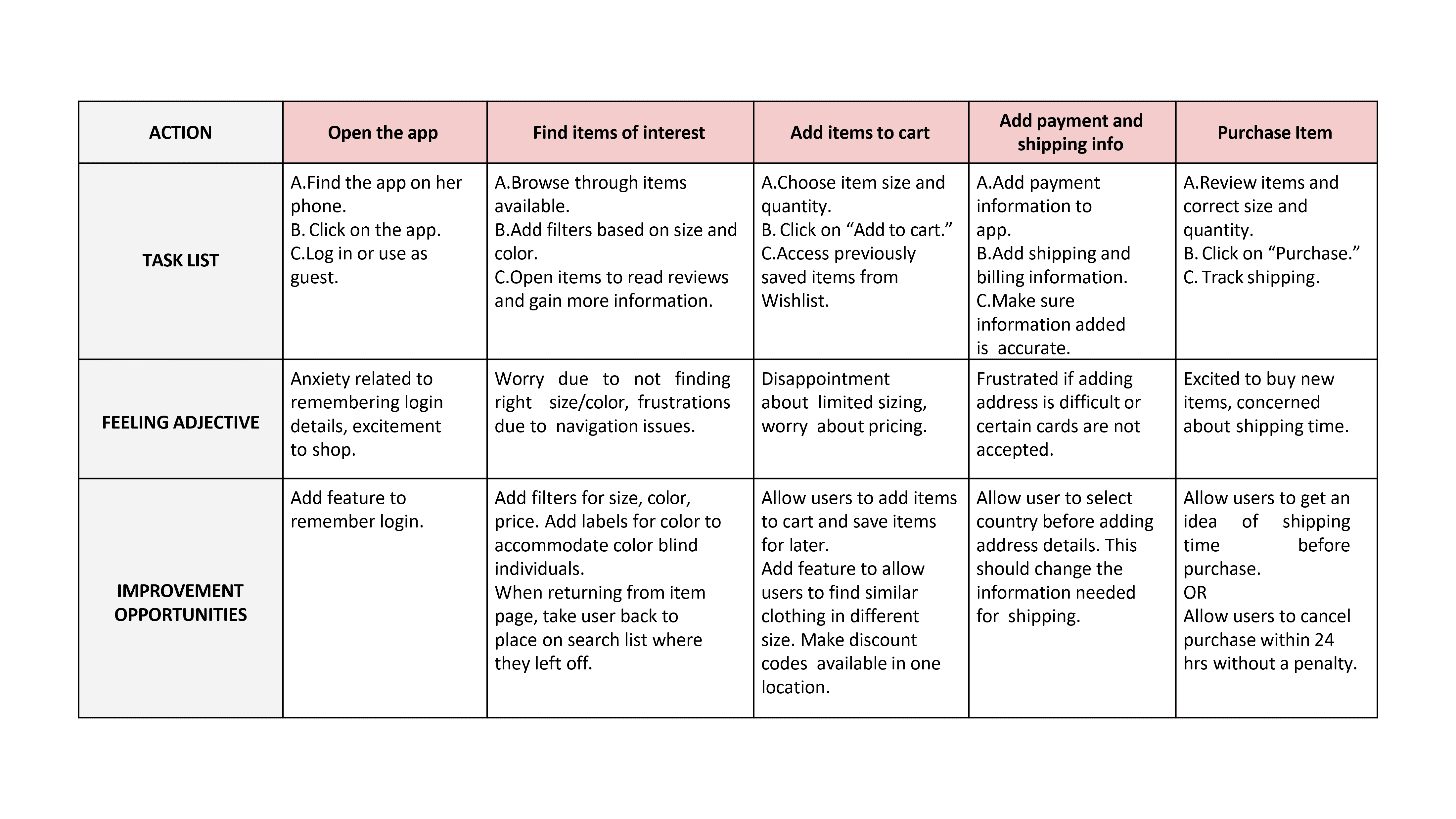
A user journey map created for Emily's persona
06
Understanding the Competitiors
One of the project objectives highlighted based on user research, was creating a user experience that provides fluid navigation abilities to its users. With this objective in mind, I wanted to gain a good understanding of norms within the shopping app industry. So, I identified a few businesses that are direct and indirect competitors of Bershka, and began looking into what these apps did well and identify areas in which more work was needed.
This step helped me realize that using existing designs as a resource can help save time and help develop innovative solutions.
07
Creating Storyboards
Now that I had an understanding of what the users wanted, what their journey might look like when using a shopping app, and how competing apps were designing experiences to suit the needs of their users; I wanted to visualize what features a shopping app could include to achieve the objectives of this project.
To do this, I created storyboards that display the big picture along with a feature-specific storyboard that helped kickstart ideation. This step helped me eliminate internal bias and focus on empathizing with the user.
After a few rounds of crazy eight brainstorming and reviews from the project manager, I used the OhioHealth Design System in Figma to design 6 different concepts that could be tested with users:
08
Information Architecture
To kickstart the design of the app and work on wireframes, I created a rough map outlining the pages that needed to be included in the app along with the projected content of these pages. I decided on these pages and their content based on what seemed absolutely necessary for the main user flow.
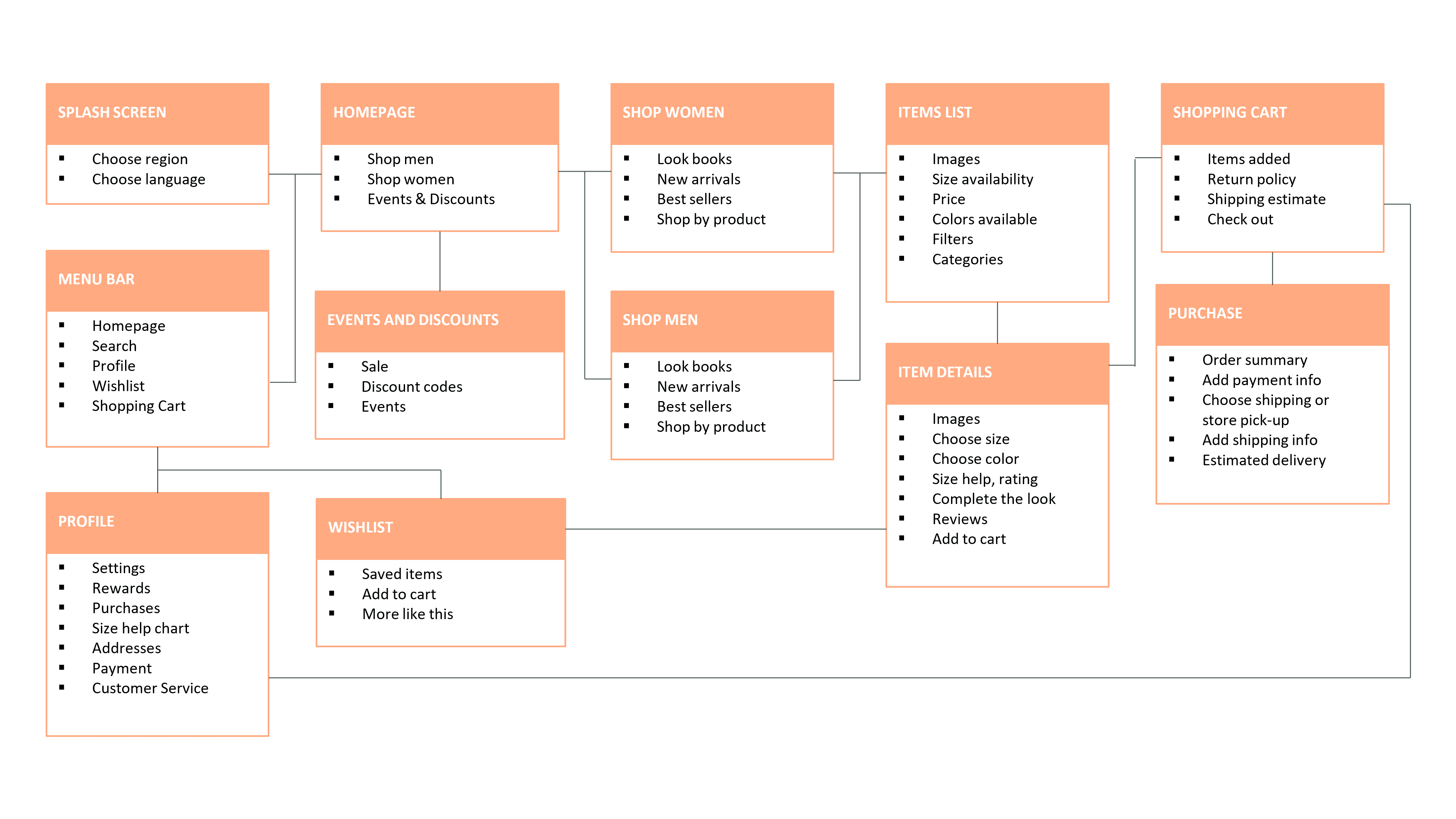
An information architecture map showing all the different content that needed to be added to the app and how each page would connect
09
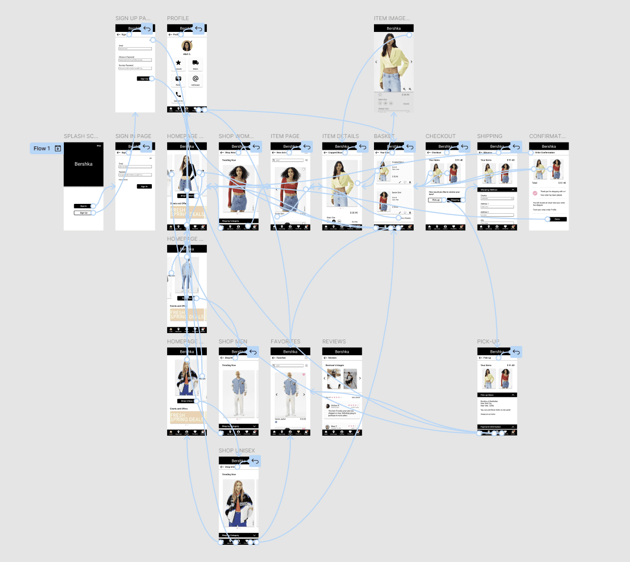
Wireframes and Design Decisions
With a rough, yet comprehensive plan for the information architecture of the app, I began sketching out some wireframes. I used brainstorming methods like "crazy eights" to generate ideas of what pages within the app should look like and went through several iterations for each page before I settled on a version that was ready to be drafted in Figma for prototyping.
My design decisions in this phase were dictated by the project objectives that were generated from user research.
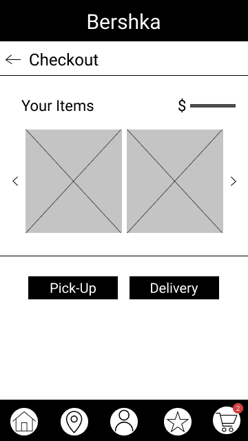
Save User's Time and Resources:
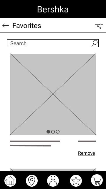
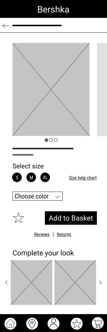
To design for this objective, I leveraged a feature that is often seen in several e-commerce apps: Favorites. A Favorites list will allow users to save items they like and order it with ease in the future without having to search for the item again.
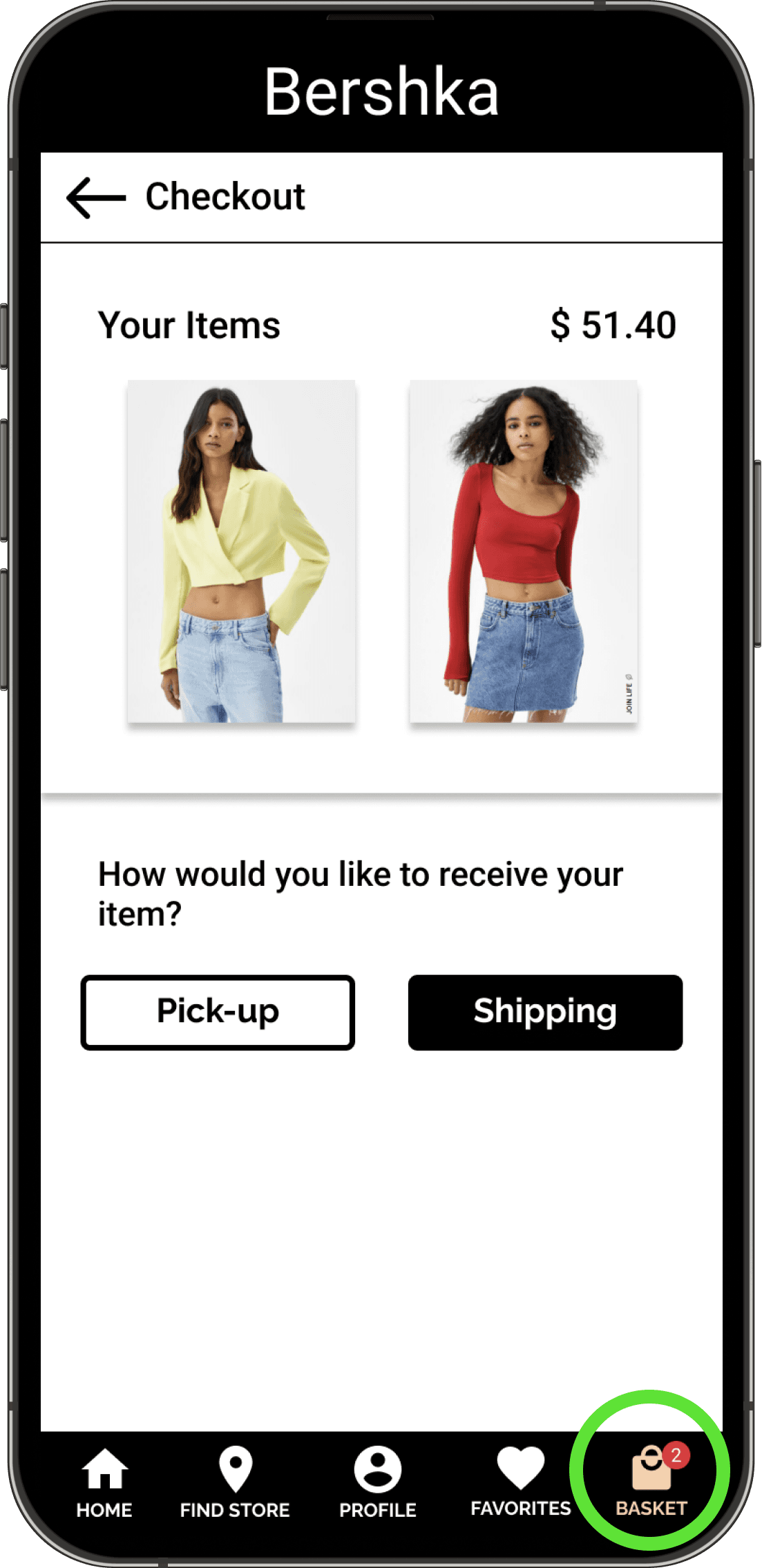
I also made the decision to add a "pick-up in store" option for users who want to save time by browsing for clothes online but don't have the time to wait for the item to be shipped to them.
Lastly, I added the option to filter through items wherever possible. This was because I wanted the design to mimic users entering a physical store and walking over to a section based on what they were looking for. This feature has been used successfully by many shopping apps.
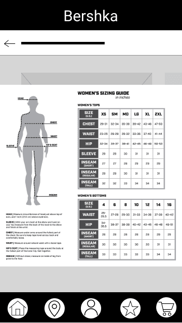
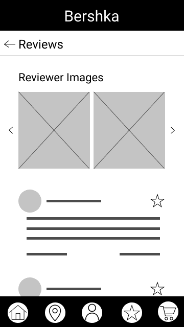
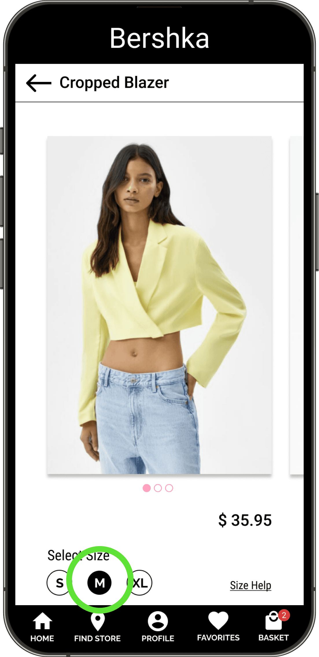
Help Users find Reliable Sized Clothing
To help users feel confident in their size choices, I wanted to include a size help chart. This chart, as seen on a few other shopping apps and websites, provides user with dimensions of clothing items. However, a lot of users either don't know their dimensions or make errors when making self-measurements. To combat this issue, I decided to add some diagrams that show how measurements should be made.
I also added a reviews section to the app to allow users to communicate experiences with each other. Within the reviews section, I decided to add a space where users could share images of clothing items with each other. I envision this feature helping users see what the clothing item would look like on people of similar statures.
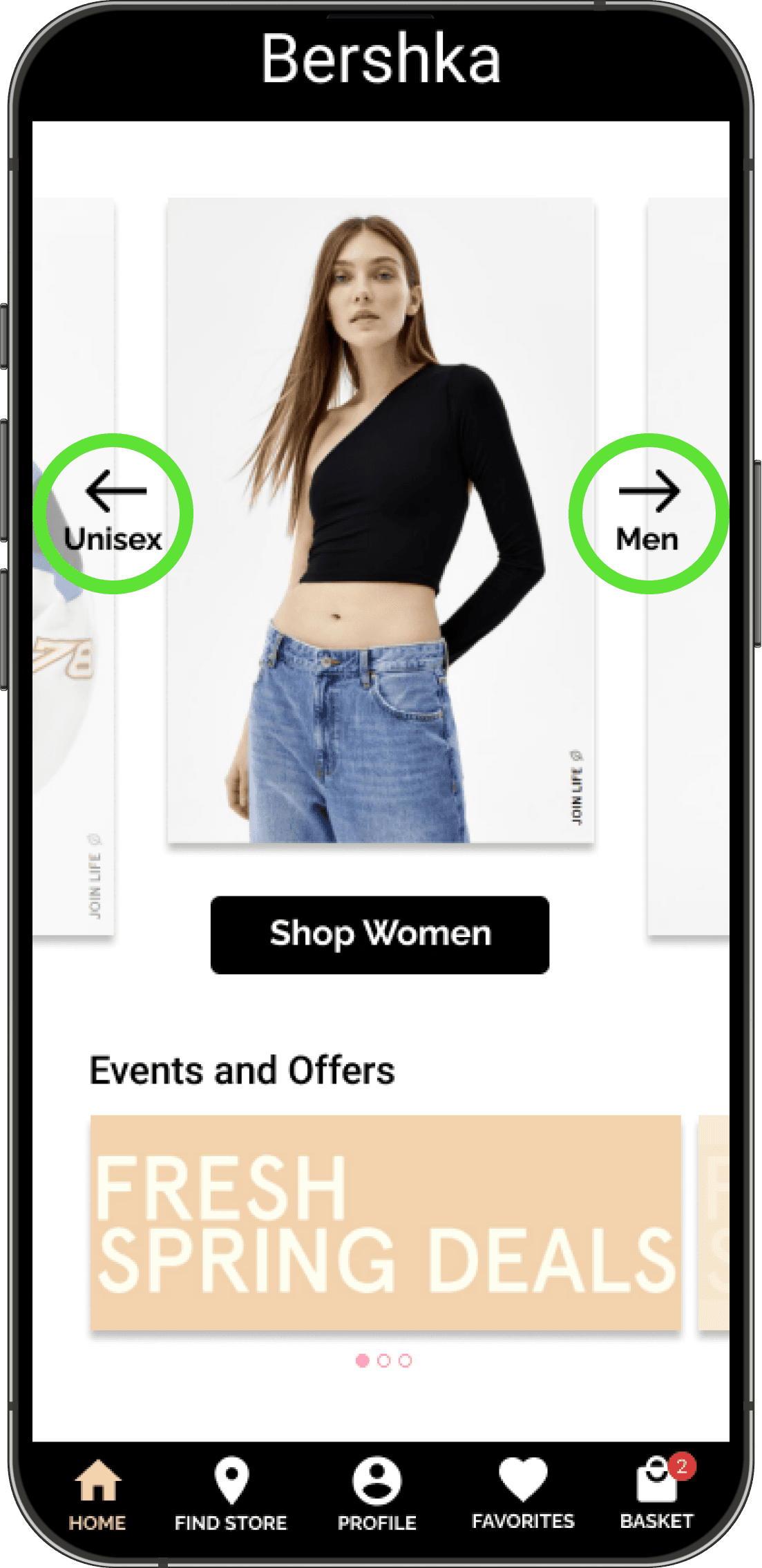
Fluid Navigation
To work towards this objective, I designed a navigation bar to be placed at the bottom of the screen. I had to put some thought into what items should be included in this bar and made choices based on the goals of the users as identified in the research phase. The homepage marks the beginning of the user journey and is an important focal point for the app. The store locator would help users find stores close to them. The profile and favorites sections would help users track orders and save information for ease of use in the future. Finally, the basket would allow users to keep track of the items they are adding to their order.
When interviewing users and trying to understand their pain points, I found that a lot of users expressed frustration about not being able to find other items that models in images were wearing. To address this pain point, I decided to add a "Complete your look" section on the item page to allow users to browse through accessories and other items featured in the image of the main item of interest.
Design an Accessible Experience
Designing in an accessible manner was integral to creating an inclusive user experience that would be of benefit to people with permanent and situational accessibility issues. Keeping this in mind, I made sure to account for contrast when placing text on colored backgrounds and added section headers text boxes as opposed to images to comply with screen readers.
I also used text to represent colors available for an item as opposed to color bubbles wherever possible. I made this decision to accommodate users who may have issues identifying colors.
Maintain Brand Identity
While most of the design decisions in relation to brand identity came when creating mockups; during the process of Wireframing, I made choices like calling the list of liked items "Favorites," as opposed to a "Wishlist," to maintain a language similar to Bershka's website. For similar reasons, I opted for language like, "Add to Basket" as opposed to "Add to Cart."
10
Usability Testing
With the wireframes and prototypes created in Figma, the next step was to test how these designs were received by the users. For the testing phase, I planned a monitored usability study where I provided 5 users with tasks to complete in the Figma prototype. I wanted to see whether users could follow the main user flow of the app and interact with features. I outlined several KPIs that would help answer this research question: time on task, user error rates, and system usability scale.
After conducting the usability tests, I had a bunch of data gathered. To identify themes and generate insights from the usability studies, I grouped my observations and notes with the help of an affinity map.
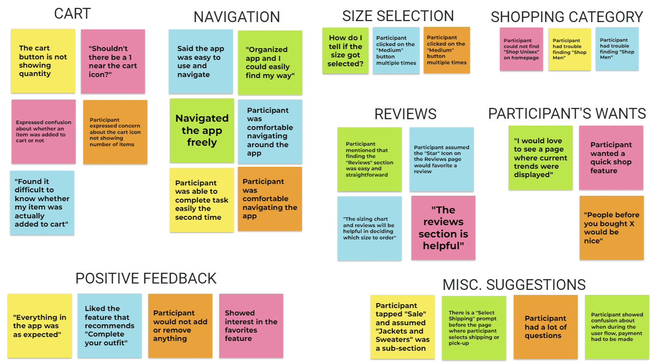
Synthesizing results from a task-based usability test
Hi-fi prototypes created in Figma
11
Key Learnings
User-centered design approach to create a successful user experience.
Importance of adding calls to action front and center.
Implementing design thinking.
Using Figma to design wireframes and prototypes.
Exercising discipline to complete the certificate course alongside graduate school responsibilities.