Re-designing the Appointment Scheduling Experience
2022 - 2024 | Re-designed the online appointment scheduling experience to result in a 5.8% increase in appointments scheduled and a 55% boost in patient satisfaction.
My role
I lead research and testing for this project and played an integral role in advocating for the user by collaborating with the Project Manager to gather and present relevant data and user stories to leadership.
I also worked closely with the Design Manager and 2 UI Designers to wireframe, design, and prototype the improved appointment scheduling experience.
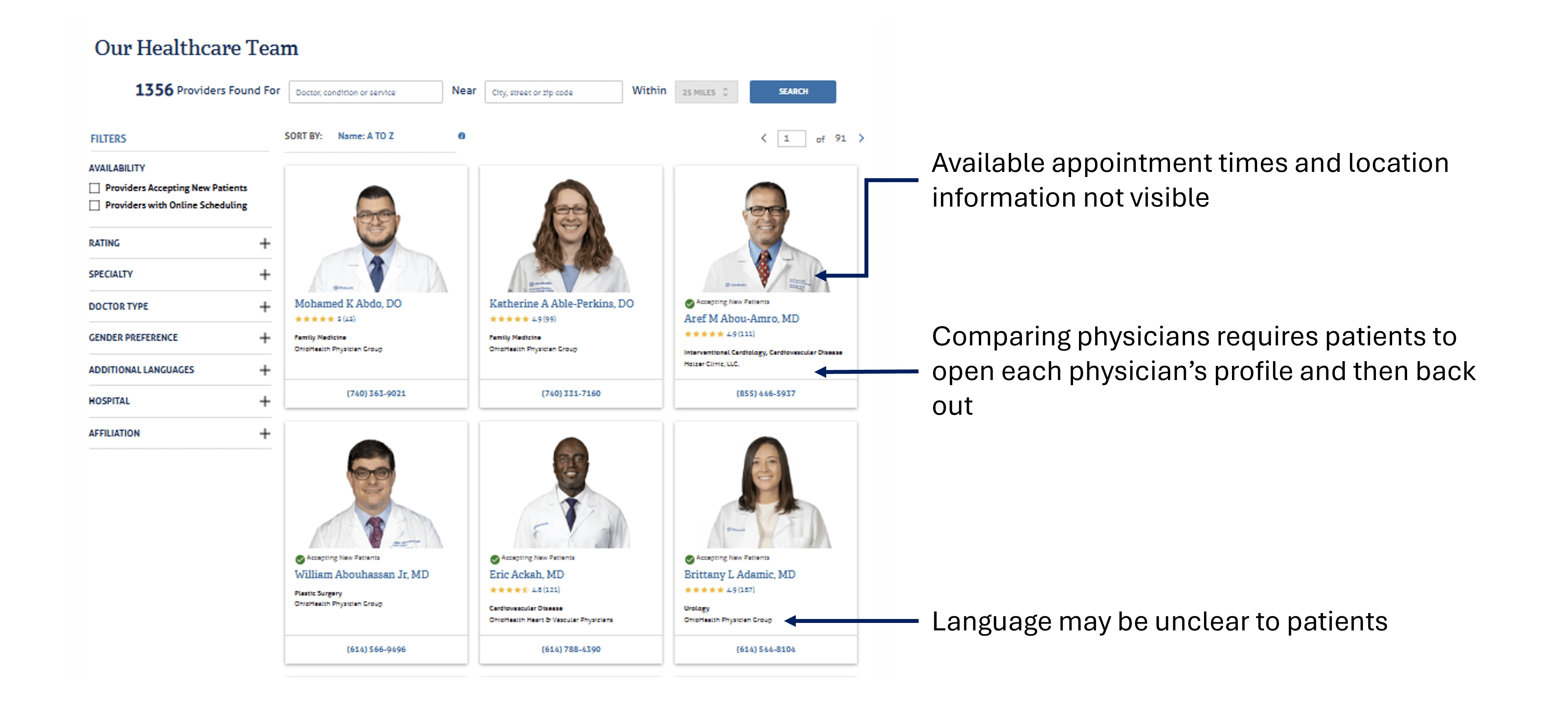
There were several issues facing OhioHealth’s existing appointment scheduling experience.
The appointment scheduling experience live on the OhioHealth website was in desperate need for an update as suggested by the high user drop-off rate (users leaving the experience before scheduling an appointment).

High drop-off rates
Too many clicks needed to schedule

Low rating on scheduling experience
How might we redesign the appointment scheduling experience to reduce patient drop-off and improve usability?
A survey revealed some of the most and least important factors contributing to a patient’s choice in physician.
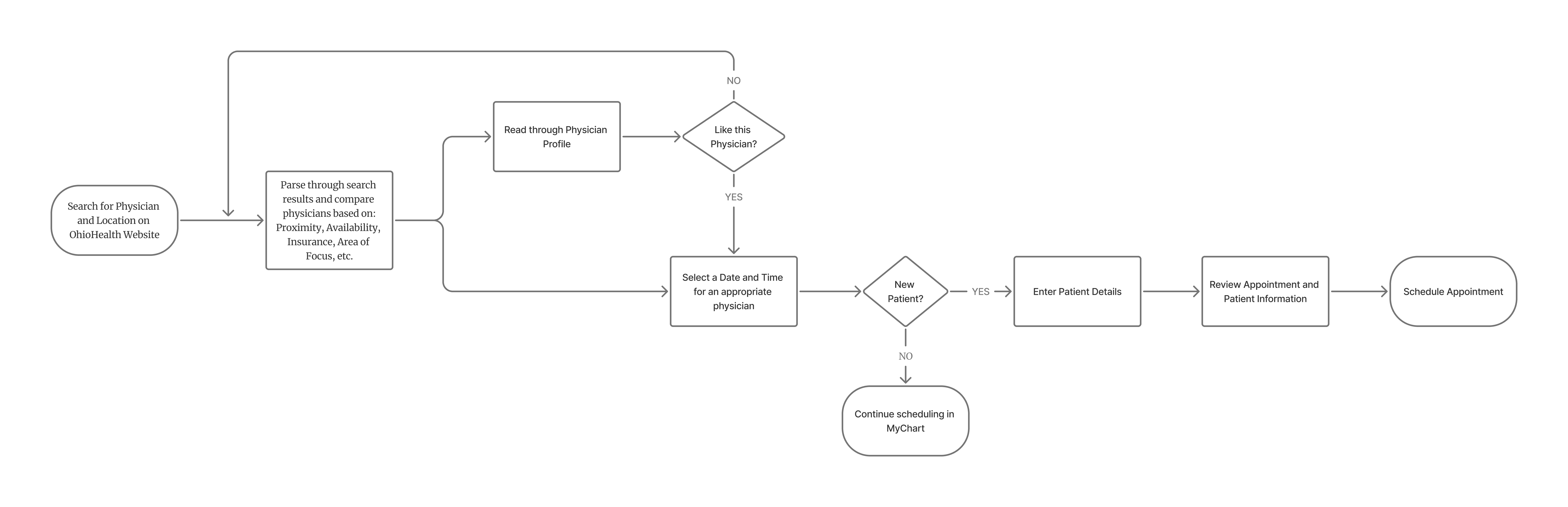
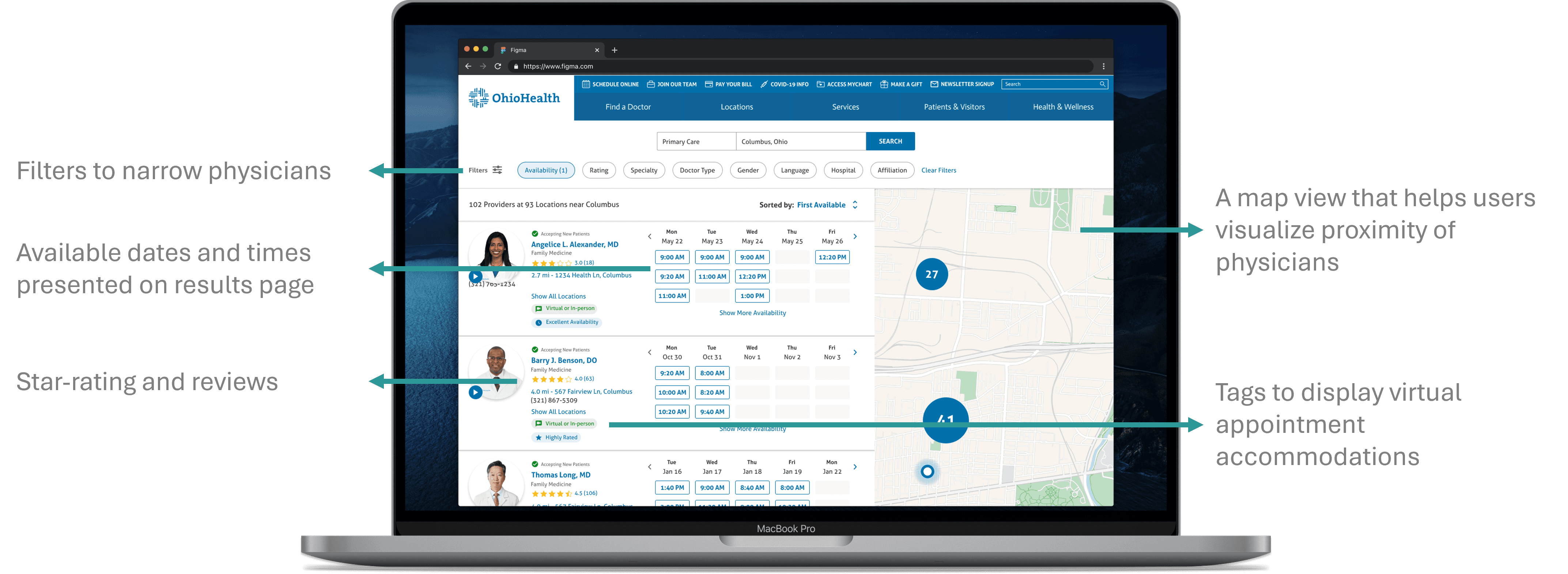
A new appointment scheduling flow was created to reduce the number of clicks and bring relevant information up-front.
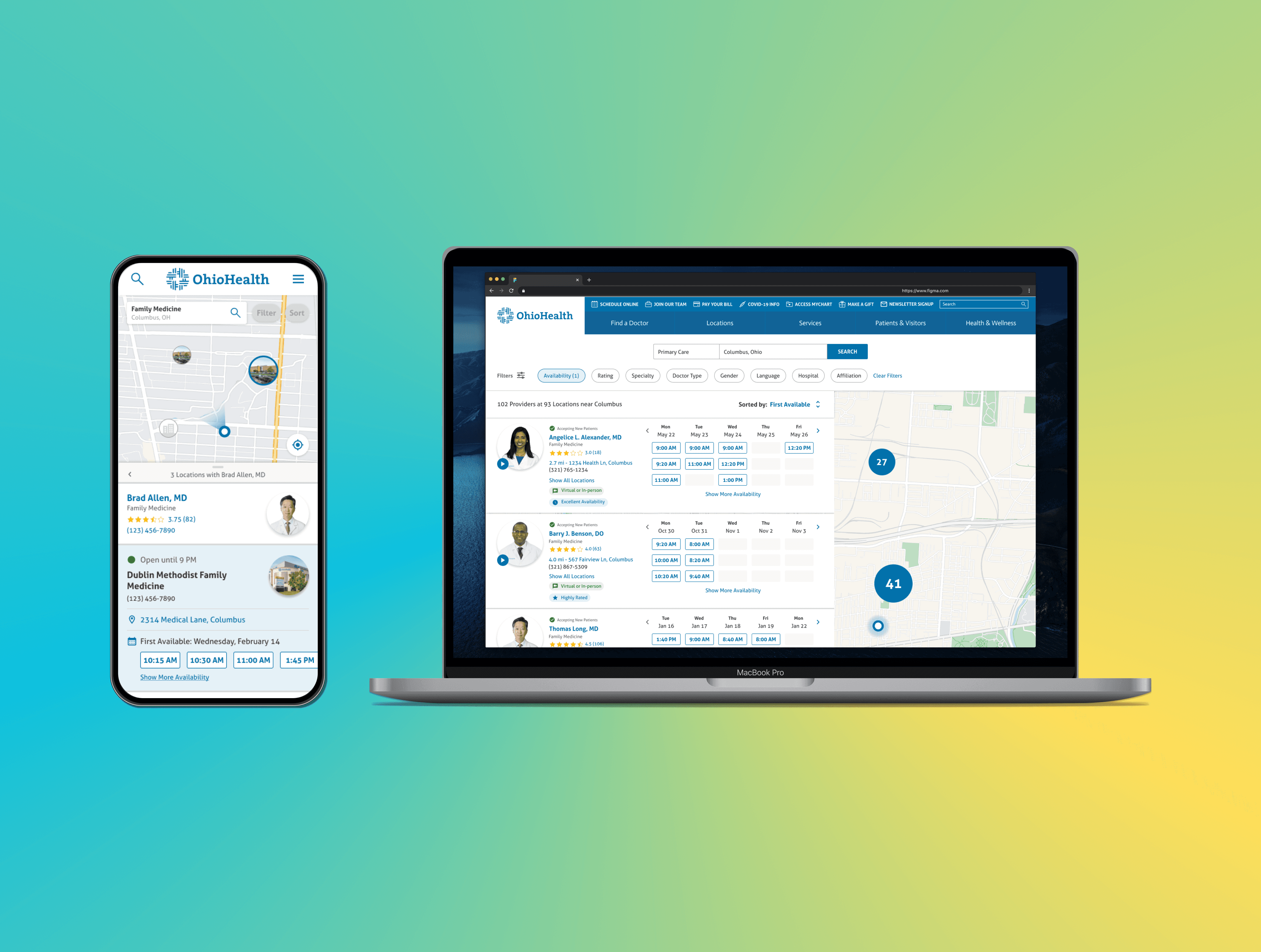
We designed 2 alternatives for an improved scheduling experience - map & list split view vs full map view.
We chose to lead with a mobile web prototype because our data depicted that majority of our users were accessing the OhioHealth website on their phones.
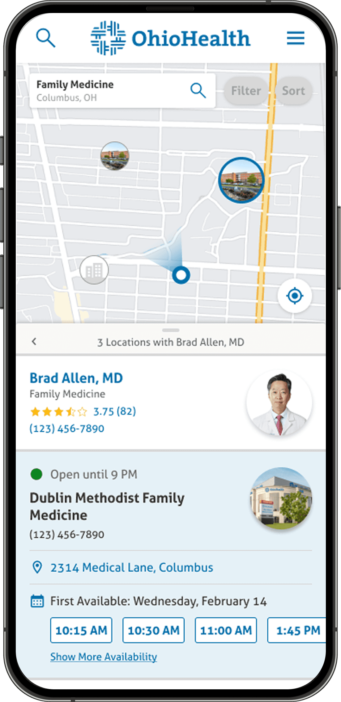
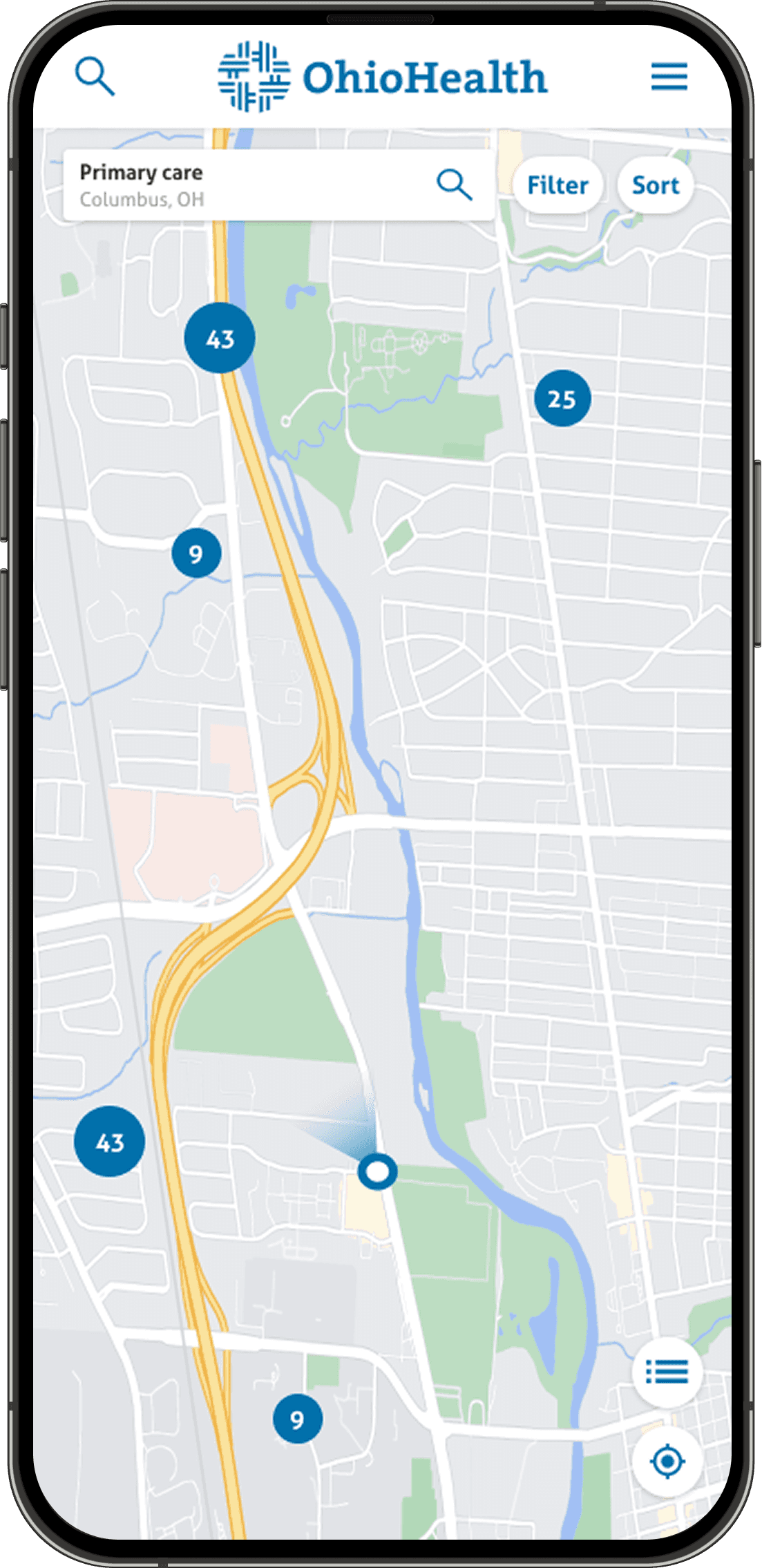
An A/B usability test of the 2 prototypes revealed a clear winner: the map & list split view.
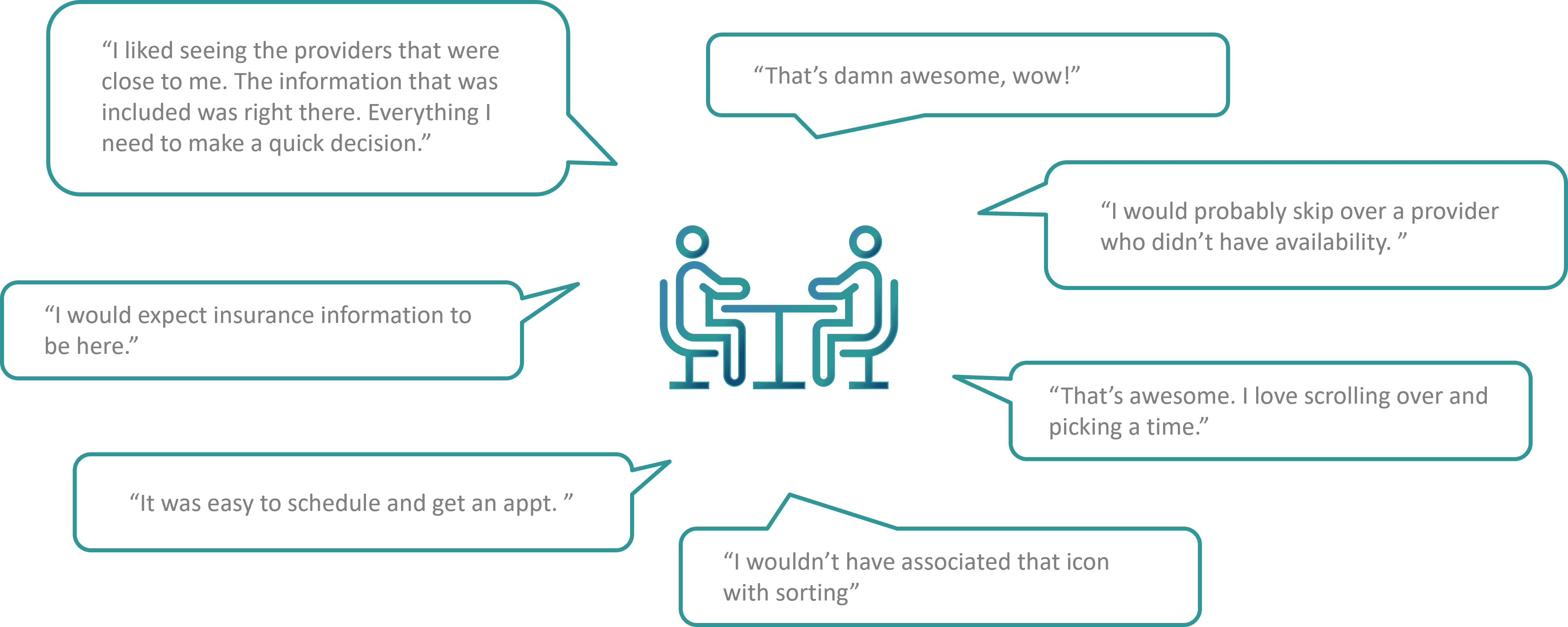
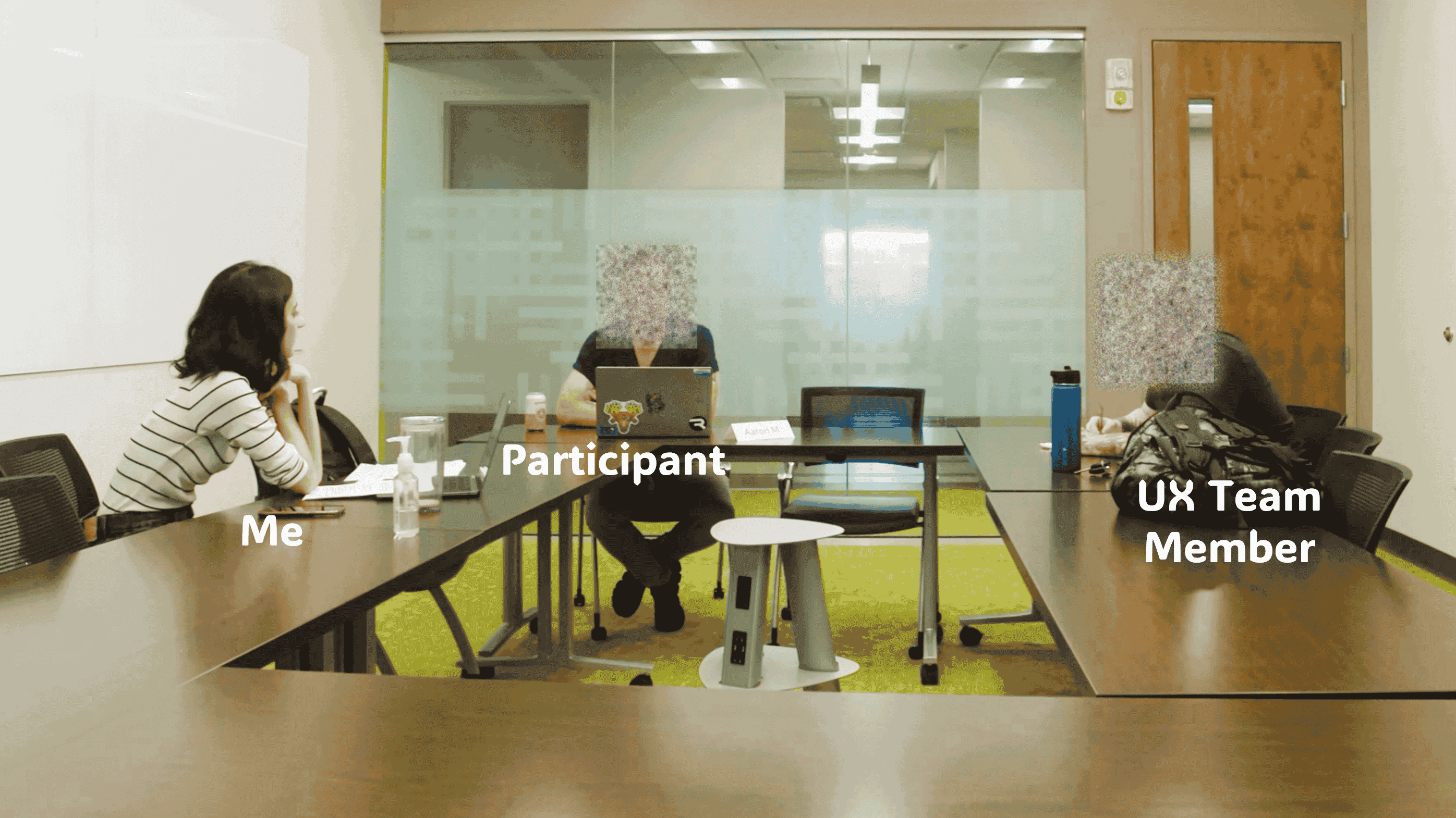
I lead task-based usability testing of the 2 prototypes supplemented by a System Usability Scale (SUS) questionnaire. Participants were asked to schedule with a physician they liked and were allowed free reign of the prototype in the latter half of the session. The map & list split view was popular amongst participants and received a higher usability score.
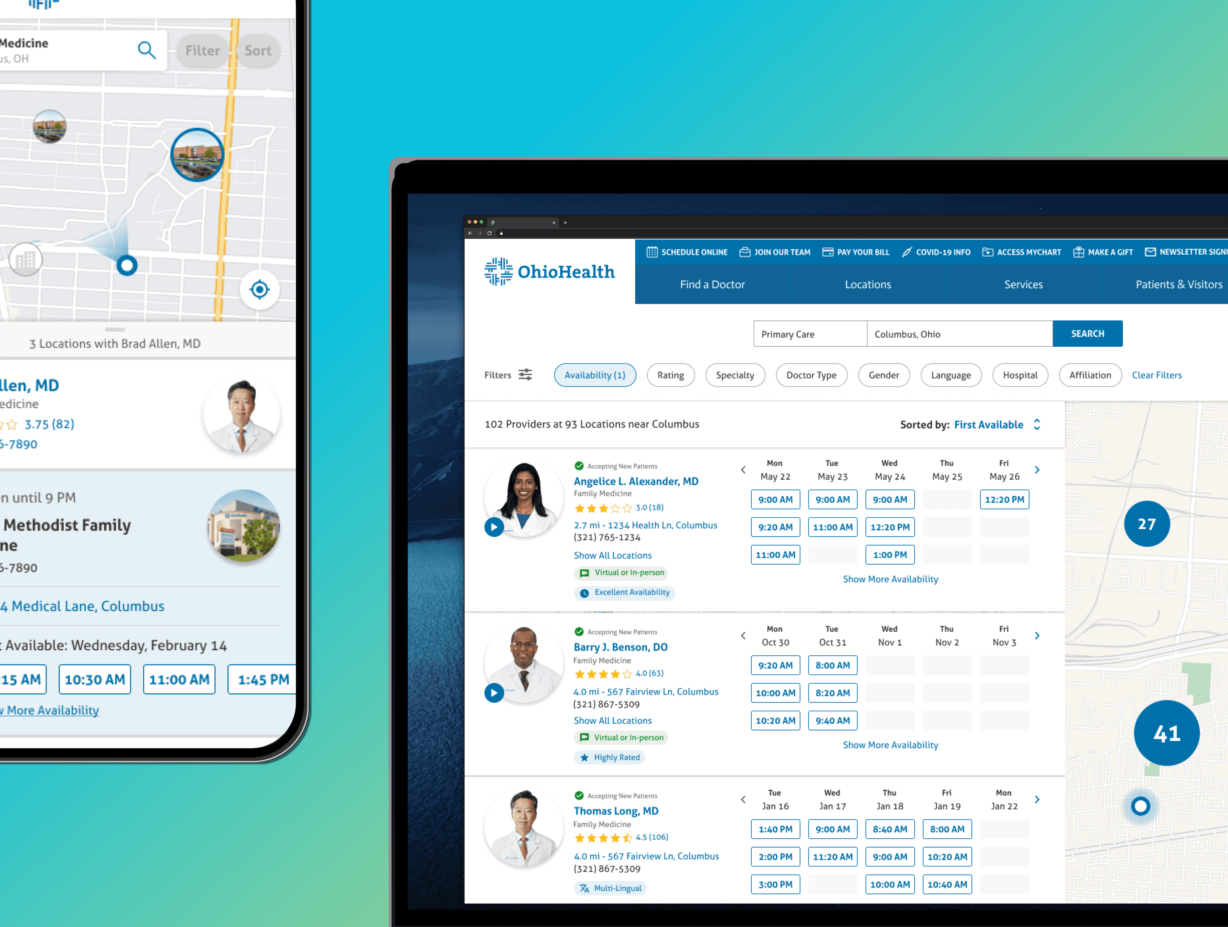
We went back to the drawing board, tweaked our mobile web design and created a desktop prototype.
A second round of usability testing with the Desktop Prototype revealed positive feedback from users.
The final designs were shared with developers and the new scheduling experience went live on desktop and mobile web early 2024!
After 3 months of going live, patient satisfaction increased by 55% and drop-off rate decreased by 5.8%.
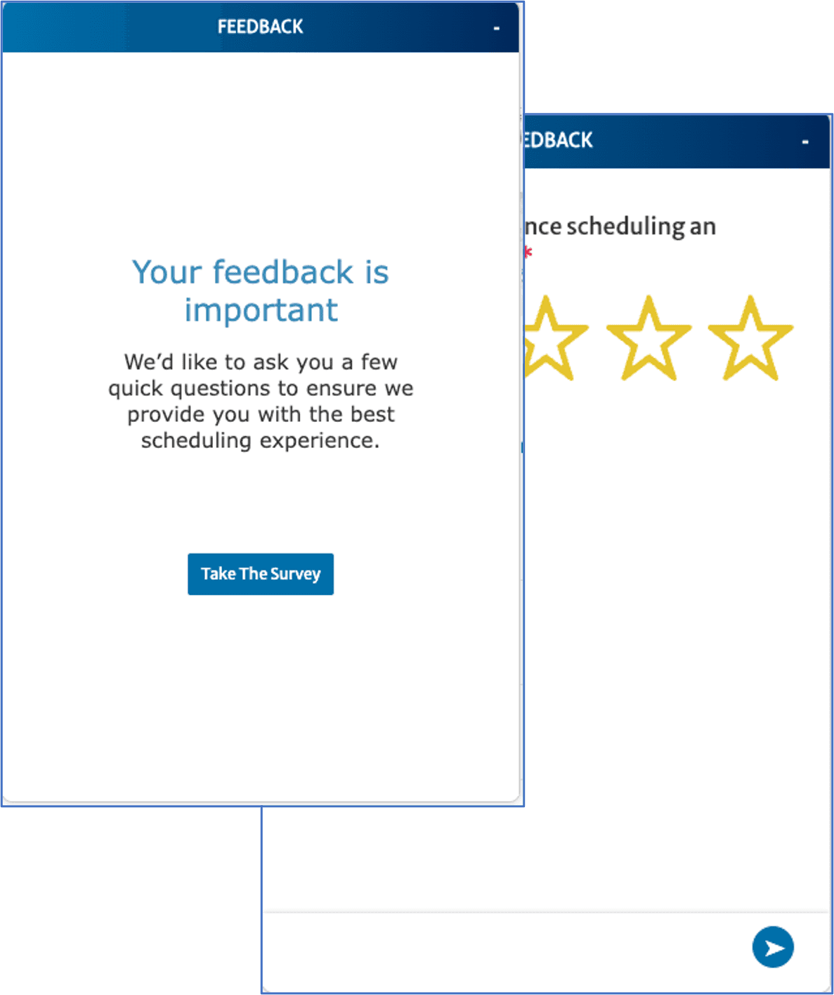
The post-scheduling survey indicated an increase in rating of the scheduling experience from 3 stars to 4.8 stars.
Click stream data also depicted a 5.8% decrease in bounce rate in the first 3 months of going live.